


A great T-shirt doesn’t become a bestseller by chance—it starts with a design that balances creativity, market trends, and printability. As customer preferences continue to evolve in 2026, businesses need designs that not only capture attention but also translate into consistent sales across online stores and retail shelves.
From choosing the right typography and color combinations to creating artwork that works across multiple garment styles, every design decision influences your product’s success. Whether you’re launching a new apparel brand or expanding an existing collection, this guide shares practical T-shirt design tips for 2026 to help you create retail-ready designs that stand out, resonate with customers, and build long-term brand value.
What to Do to Make a Good T-shirt Design for Print-on-Demand?
Creating a successful print-on-demand (POD) T-shirt design requires more than a creative idea. Your artwork must look appealing on-screen while also printing cleanly on fabric. Paying attention to a few technical details during the design stage can significantly improve the final product and increase its chances of becoming a bestseller.
Start with High-Resolution Artwork
Always create or export your design at 300 DPI. High-resolution artwork produces crisp lines, smooth gradients, and professional-looking prints. Low-quality files often become pixelated or blurry once printed, reducing the perceived value of your apparel.
Choose the Right Design Placement
The placement of your artwork directly affects how the T-shirt looks when worn. For most adult shirts, a center-chest design positioned approximately 2–3 inches below the collar provides the most balanced appearance. Smaller logos work well on the left chest, while oversized graphics should be proportioned carefully to avoid overwhelming the garment.
Create Strong Color Contrast
Your design should remain clearly visible regardless of the shirt color. Bright artwork placed on dark garments—or darker artwork printed on light-colored shirts—typically creates the strongest visual impact. Avoid using colors that closely match the garment, as they can make important details difficult to distinguish after printing.
Export the Correct File Format
For the cleanest results, save your artwork as a vector file whenever possible. If you’re using raster artwork, export it as a transparent PNG to eliminate unwanted background boxes or white borders around your design.
Think Beyond the T-shirt
If you’re building a brand, create artwork that can easily extend to other promotional products like tote bags, drinkware, caps, or accessories. This allows you to expand your merchandise collection without redesigning every graphic. If you’re exploring ideas beyond apparel, promotional product printing helps turn the ideas and beautiful artworks into real-world products.

Tips for T-shirt Design Placement and Size for Different Use Cases
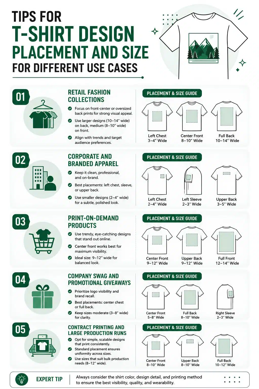
The placement and size of your design are just as important as the artwork itself. Even an excellent illustration or logo can lose its impact if it’s positioned incorrectly or scaled out of proportion. Different business goals call for different design layouts, so understanding where and how large your artwork should be helps create a more polished, retail-ready product.
Retail Fashion Collections
If you’re designing for fashion brands or online stores, the artwork should complement the garment rather than dominate it. Oversized graphics remain popular for streetwear, while minimalist chest logos continue to perform well for premium lifestyle brands.
As a general guideline:
- Left chest logos: 3–4 inches wide
- Standard front graphics: 9–11 inches wide
- Oversized fashion prints: 11–13 inches wide (depending on garment size)
The design should always leave enough breathing room around the edges so the shirt doesn’t appear overcrowded.
Corporate and Branded Apparel
Business apparel requires a more understated approach. Company uniforms, event shirts, and promotional apparel typically prioritize professionalism over bold graphics.
For most corporate garments:
- Left chest logos work best for everyday uniforms.
- Full back graphics are useful when visibility is important, such as at trade shows or outdoor events.
- Sleeve logos can reinforce branding without distracting from the primary design.
Keeping placement consistent across every garment helps employees present a unified image. If you’re developing apparel for an organization, reviewing different examples of branded apparel can provide useful ideas for professional logo positioning.
Print-on-Demand Products
Print-on-demand collections often include multiple garment styles, so flexibility becomes important. A design that looks perfect on a heavyweight T-shirt may need slight adjustments before being printed on tank tops, long sleeves, or hoodies.
Instead of creating separate artwork for every product, design with adaptability in mind. Simple compositions and balanced layouts usually translate more effectively across an entire merchandise collection. Businesses exploring on-demand merchandise often benefit from creating artwork that scales well across different product categories.
Company Swag and Promotional Giveaways
Promotional shirts serve a different purpose than retail apparel. They need to maximize brand visibility while remaining comfortable enough that recipients actually wear them.
For company swag:
- Place logos where they’re immediately recognizable.
- Keep messaging short and readable.
- Avoid filling every available space with graphics.
A clean design generally performs better than one overloaded with information. Well-designed company swag is more likely to become part of someone’s regular wardrobe, increasing long-term brand exposure.
Contract Printing and Large Production Runs
When producing hundreds or thousands of garments, consistency becomes the top priority. Establish placement measurements, artwork dimensions, and print specifications before production begins so every shirt matches regardless of size or production batch.
Document details such as logo width, distance from the collar, and alignment references. This minimizes production errors and simplifies future reorders. Businesses working with contract decoration services or contract screen printing often create detailed artwork guidelines to ensure every production run meets the same quality standards.
No matter the application, the best T-shirt designs balance proportion, placement, and purpose. Designing with the end use in mind results in apparel that not only looks professional but also performs better in retail, promotional, and corporate environments.
Artwork Quality and Resolution Tips for High-End T-shirt Printing
The quality of your printed T-shirt begins long before the garment reaches the press. Even the most advanced printing equipment cannot compensate for poor artwork. Whether you’re creating apparel for retail, promotional campaigns, or corporate branding, starting with production-ready design files ensures sharp prints, accurate colors, and a professional finish that customers expect from premium apparel.
Always Design at High Resolution
One of the most common printing mistakes is using artwork that looks acceptable on a computer screen but falls apart when enlarged for printing.
For professional T-shirt printing:
- Create raster artwork at 300 DPI.
- Use the final print dimensions from the beginning.
- Avoid enlarging small images after they’ve been created.
Low-resolution files often produce blurry edges, jagged text, and visible pixels that reduce the perceived quality of the finished garment.
Use Vector Graphics Whenever Possible
Logos, icons, and typography should ideally be created as vector graphics. Unlike raster images, vector files can be resized without losing quality.
Preferred file formats include:
- AI
- EPS
- SVG
Vector artwork produces cleaner lines and sharper details, especially for company logos, text-heavy designs, and minimalist graphics that require precise edges.
Choose Colors That Print Clearly
Colors displayed on a monitor don’t always translate perfectly onto fabric. Bright, high-contrast designs generally produce stronger visual results than artwork with subtle tonal differences.
When preparing artwork:
- Avoid relying on extremely fine gradients.
- Ensure sufficient contrast between the design and garment color.
- Keep small text away from similarly colored backgrounds.
Designing with print limitations in mind helps maintain readability across different garment colors and fabric types.
Keep Small Details Readable
Highly detailed illustrations can look impressive digitally but may lose clarity when printed on fabric. Thin outlines, tiny decorative elements, and miniature text should be simplified whenever possible.
Before submitting artwork, zoom out and view the design at its actual print size. If important details become difficult to distinguish on-screen, they’ll likely be even harder to reproduce during printing.
This simple check helps eliminate unnecessary revisions later in the production process.
Export Files Correctly
Even well-designed artwork can create problems if exported incorrectly.
For best results:
- Use transparent backgrounds for PNG files.
- Embed fonts or convert text to outlines.
- Remove hidden layers and unnecessary objects.
- Double-check the final export dimensions.
Taking a few extra minutes to prepare production-ready files significantly reduces printing errors.
Maintain Consistency Across Large Orders
Businesses producing apparel collections, uniforms, or promotional merchandise should establish standardized artwork specifications before production begins.
This includes documenting:
- Logo dimensions
- Color values
- Placement measurements
- Approved file versions
Consistent artwork standards help maintain uniform branding across future reorders, regardless of garment style or production quantity.
Companies working with specialized services such as contract embroidery often rely on these production standards to ensure logos remain consistent across multiple decoration methods.
Similarly, organizations producing apparel under union manufacturing requirements benefit from having standardized artwork that meets quality expectations across every production run.
When tight deadlines arise, properly prepared artwork also helps accelerate production because fewer revisions are needed before printing begins. This becomes particularly valuable when using rush printing services, where production schedules leave little room for correcting file issues after submission.
Ultimately, high-end T-shirt printing starts with high-end artwork. Investing time in proper file preparation ensures sharper graphics, more consistent branding, and apparel that reflects the professionalism of your business.

Methods for Printing Designs on T-shirts
Choosing the right decoration method is just as important as creating a great design. Different printing techniques offer unique advantages depending on your artwork, budget, order quantity, and target audience. The three most popular methods for producing high-quality custom T-shirts are screen printing, DTF transfers, and embroidery.
Screen Printing
Screen printing remains one of the most widely used methods for producing custom T-shirts, particularly for medium and large production runs. The process involves pushing ink through a mesh screen onto the fabric, with each color requiring its own screen.
This method produces vibrant, long-lasting prints with excellent color opacity, making it ideal for bold graphics, company logos, event merchandise, and promotional apparel. Screen printing is especially cost-effective when producing high volumes because the setup costs are spread across larger quantities.
However, it is less suitable for highly detailed artwork, photographic designs, or small orders since creating separate screens for each color increases setup time and expense.
Best for:
- Bulk apparel orders
- Corporate uniforms
- Event merchandise
- Simple logos and bold graphics
DTF (Direct-to-Film) Transfers
DTF transfers have quickly become one of the most versatile decoration methods in the apparel industry. Instead of printing directly onto the garment, the design is first printed onto a special transfer film and then heat-pressed onto the fabric.
This technique allows businesses to reproduce detailed artwork, gradients, fine text, and full-color illustrations with impressive accuracy. Unlike screen printing, DTF does not require separate screens for each color, making it ideal for short runs, personalized apparel, and print-on-demand businesses.
DTF transfers also work well on a wide variety of fabrics, including cotton, polyester, blends, performance wear, and many specialty garments, giving brands greater flexibility when expanding their product lines.
Best for:
- Full-color artwork
- Small and medium production runs
- Print-on-demand businesses
- Personalized garments
- Complex illustrations and photographs
Embroidery
Embroidery uses thread rather than ink to decorate garments, creating a premium, textured finish that communicates professionalism and durability. Logos are stitched directly into the fabric using computerized embroidery machines, making this method particularly popular for uniforms, polos, jackets, caps, and corporate apparel.
While embroidery offers exceptional durability and a high-end appearance, it is generally best suited for simple logos and text. Highly detailed artwork or large illustrations often require significant simplification because thread has physical limitations that differ from printed ink.
Although embroidery is typically more expensive than printed methods, it provides unmatched longevity and a sophisticated finish that many businesses prefer for customer-facing employees.
Best for:
- Company uniforms
- Polo shirts
- Hats and caps
- Jackets and outerwear
- Premium corporate branding
Which Method Is Right for Your Business?
There is no single “best” printing method—only the one that best matches your project. Screen printing delivers outstanding value for large production runs, DTF transfers provide unmatched flexibility for detailed artwork and smaller orders, while embroidery creates a premium finish that elevates professional apparel. Understanding the strengths of each method allows businesses to select the most effective decoration technique for every product they create.
Mistakes to Avoid in T-shirt Design
Even the most creative concept can fail if common design mistakes are overlooked. A T-shirt should not only look attractive on a screen but also print well, fit naturally on the garment, and appeal to its target audience. Avoiding the following mistakes can significantly improve the quality and commercial success of your designs.
Using Low-Resolution Artwork
One of the biggest mistakes is submitting low-quality images for printing. Blurry graphics, pixelated logos, and jagged text immediately reduce the perceived value of the finished product. Always design at 300 DPI and use vector files for logos whenever possible to ensure sharp, professional prints.
Ignoring Garment Color
A design that looks fantastic on a white background may disappear completely on a dark-colored shirt. Failing to consider color contrast can make important details difficult to read.
Before finalizing your artwork, preview it on different garment colors and adjust the palette if necessary to maintain strong visibility.
Overcomplicating the Design
Trying to include too many elements often results in a cluttered composition. Excessive text, multiple fonts, unnecessary graphics, and too many colors compete for attention instead of delivering a clear message.
Simple, focused designs are generally easier to recognize, easier to print, and more memorable.
Choosing the Wrong Placement
Artwork placement has a major impact on how the T-shirt looks when worn. Designs positioned too high, too low, or too close to seams often appear awkward.
Always plan placement based on the garment type and intended purpose, whether it’s a left-chest logo, center graphic, or full-back design.
Using Fonts That Are Difficult to Read
Decorative fonts may seem visually interesting but can become unreadable when printed, especially at smaller sizes.
Choose typefaces that remain clear from a distance and avoid using multiple font styles in a single design unless they complement each other.
Designing Without Considering the Target Audience
A design that appeals to teenagers may not resonate with corporate professionals, fitness enthusiasts, or luxury shoppers. Successful T-shirt designs always begin with understanding who will wear them.
Consider your audience’s preferences, lifestyle, and buying habits before selecting colors, graphics, and messaging.
Forgetting About Print Size
Designing without knowing the final print dimensions often leads to artwork that appears too small or disproportionately large.
Always create your design based on its intended print size and preview it on a garment mockup before production.
Not Testing Before Large Production
Skipping sample prints can lead to expensive mistakes, especially for bulk orders. Colors may print differently than expected, small details may disappear, or placement may need adjustment.
Ordering a sample first allows you to identify issues before committing to a full production run, helping protect both your budget and your brand reputation.
To Wrap Up
Creating a retail-ready T-shirt bestseller in 2026 requires more than eye-catching artwork. From choosing the right printing method and preparing high-resolution design files to selecting proper placement, sizing, and colors, every detail contributes to the final product’s success.
Whether you’re building a fashion label, launching print-on-demand merchandise, or producing branded apparel for businesses, thoughtful design decisions help maximize both customer appeal and print quality.
By applying these T-shirt design tips and avoiding common mistakes, you’ll create products that not only look professional but also deliver lasting value, strengthen your brand, and stand out in an increasingly competitive apparel market.
Frequently Asked Questions
1. What makes a T-shirt design retail-ready?
A retail-ready T-shirt design combines attractive visuals with proper print resolution, balanced placement, readable typography, strong color contrast, and production-ready artwork. It should also appeal to a clearly defined target audience and print consistently across different garment styles.
2. Which printing method is best for custom T-shirts?
The best printing method depends on your project. Screen printing is ideal for bulk orders, DTF transfers work well for detailed full-color artwork and small batches, while embroidery is best for premium logos on polos, jackets, and corporate apparel.
3. What resolution should I use for T-shirt artwork?
Professional T-shirt artwork should be created at 300 DPI at the final print size. Vector files (AI, EPS, SVG, or PDF) are recommended for logos and typography because they remain sharp at any size.
4. How large should a front T-shirt design be?
Most adult center-front designs range between 9–11 inches wide, while left chest logos are typically 3–4 inches wide. The ideal size depends on the garment style, target audience, and intended use.
5. What are the biggest mistakes to avoid when designing T-shirts?
Common mistakes include using low-resolution artwork, poor color contrast, overcrowded layouts, incorrect design placement, unreadable fonts, and skipping sample prints before large production runs.